Zero-Glow UI Design: Restraint, Contrast, and the Death of Purple Cards
Why the AI industry fell into lazy neon purple gradients and how Kanna crafted an uncompromising dark void aesthetic inspired by Cindy and Swiss typography.

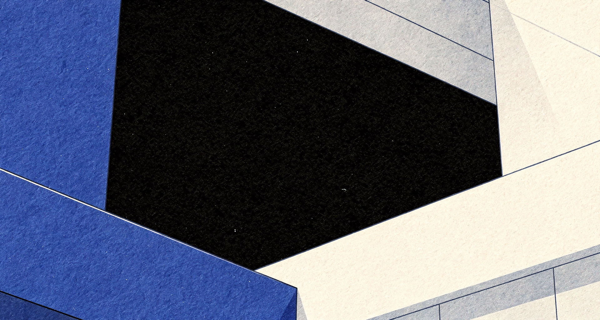
Browse any startup directory in 2026 and you will encounter the exact same visual clichés: neon purple-to-blue gradients, floating 3D glass spheres, frosted glassmorphism cards with glowing borders, and particle dust floating across an ill-defined grid.
This aesthetic is not design; it is a template crutch. It attempts to disguise a lack of visual identity behind a barrage of GPU shaders.
The Cindy Paradigm: Restraint and Painterly Precision
When Cindy.app emerged, it disrupted this monotony by marrying hyper-refined 2D painterly anime game splash art with austere, high-contrast typography and void backgrounds.
Kanna pushes this philosophy into the developer tools space:
- No Plastic Glassmorphism: Cards have crisp hairline borders (
rgba(59, 130, 246, 0.18)) rather than blurry frosted backdrops. - Deep Void Backgrounds: The canvas is pitched at deep obsidian (
#080B11), giving room for high-chroma electric cobalt (#2563EB) and warm amber (#F59E0B) to pop with deliberate intention. - Tactile Paper & Fabric Textures: Subtle micro-relief patterns evoke the physical feel of a hand-knitted cream cardigan and heavy archival paper grain.
/* The Hairline Border Contract */
.hud-border {
  border: 1px solid rgba(59, 130, 246, 0.18);
  background: rgba(13, 18, 29, 0.75);
  backdrop-filter: blur(12px);
}
True luxury in software UI comes from typography, generous whitespace, razor-sharp contrast, and disciplined color restraint.